ANYWAY--- I purchased a Jessica Sprague online class so I could quickly learn some really cool things about PSE. It was intended to be a 2 week course, but I was so into it that I did it all in 2 days!!! I've learned some awesome things. I don't have them all stored in my memory yet, but I have a pretty good grasp on a lot of things. Here are some pics (before/after) that I completed in the course.
Before:

After:
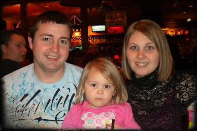
Cropped, fixed red eye, and added an inked overlay from the downloaded course material (courtesy of House of 3).
Before:

After:
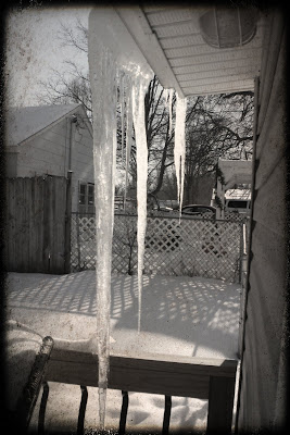
On this photo, I applied a couple different textures, including one with the darker edge.
Before:

After:
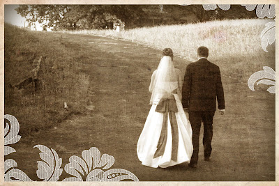
This photo has a lot more going on! First, I cropped the image down to size, transformed it into a sepia tone, used THREE different textures, and added a "Paper Edge Frame" created by J. Sprague, which was part of the downloaded course material.
Before:

After:
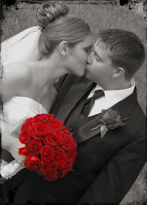
This is a photo I have done before, but lost it when my computer crashed! :-( Luckily I still have all of the raw images, but all of the edits are gone. Anyway, I cropped this photo and changed the orientation to vertical, converted the color to B&W, spot colored the bouquet, and added the inked edge frame.
Before:

After:
Cropped, added some texture, and then added the text, which I then placed behind the texture. Love this look-- it looks like a piece of old paper that's been folded up! (Might I add- this picture was taken when I was 20 lbs. heavier! It makes me sick to look at this picture, but it was a stage in my life and I just have to embrace it, and appreciate the changes that my body has gone through now!!)
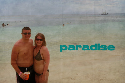
Before:

After:
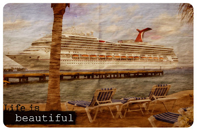
Okay, so this picture has LOTS LOTS LOTS going on!! First, I created a mask using the rounded rectangle tool. Applied a couple textures, one of those being a similar "folded paper" look as the last photo, but not as many folds in it... created an edge burn, and added the "Life is..." overlay, which was set to the "multiply" blending mode. Finally, I hid the overlay behind the mask. Whew! I don't really like the "Life is..." overlay on this photo, but it was part of the lesson... :-) The photo itself, though... I LOVE it! I think it looks like a postcard!
 So, that's what I've been learning the last couple of days! There were a few more lessons- one was creating a 3-pic storyboard with text, and the next was a 9-pic document using a flourish brush, and last was another 9-pic doc utilizing several different techniques. I watched the vids, but didn't create anything for them yet.
I would love to know what you think! Leave me a comment!

4 comments:
Valerie - I took that class and it is a blast. Her lessons are always so easy to follow, downloads are great and the finished projects are wonderful. I love what you created - and yes, they are addictive.
Valerie, you really did a wonderful job on all your pictures. I took the free class over summer and I need to retake it.
What a fabulous job Valerie! I so need to go and take some of these classes...what an inspriation you are!
Wow! Those pictures are all wonderful! You did a great job.
Post a Comment